As mentioned in the previous blog this meeting was attended by Dr Mike Wald, Yunjia Li and E.A.Draffan – Gary Wills sent his apologies.
Responsive Design
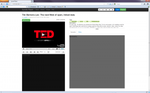
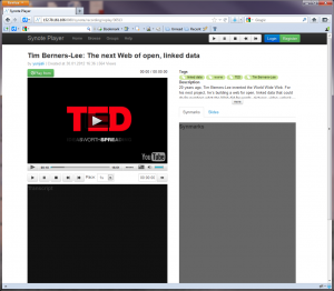
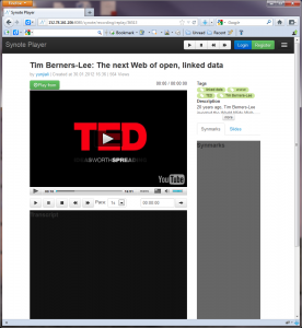
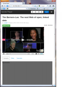
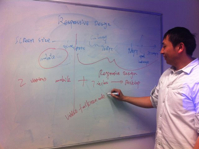 It all started on the white board where Yunjia explained how he was adapting his design to fit with the problem of 7 inch plus screens versus the average smart phone screen. He demonstrated the ever narrowing of the viewing area and how the video, annotation and transcription windows could shrink and eventually offer access via tabs. But when it came to mobile phone users there was a need to rearrange the view to be totally linear. In other words two versions of Synote mobile but with changes that would happen automatically depending on the metadata received.
Here are four views of Synote mobile on the different sized screens
It will be very important to gather the metadata from the media so that the correct view and player can be selected. At present there are 3 useful approaches for this demonstrator – ffmpeg and YouTube has an api with metadata such as title, resolution etc and finally the link to the file format itself offers metadata which can be drawn out by a commercial service and this would need to be re-created if we did not want to pay for the service. The minimum amount of data needed is the duration of the media, the format and coding and whether it is video or audio.
It just so happened that there was a blog on this subject that fitted the discussion around screen size issues. Titled “What’s next for mobile now that adaptive design has failed?” it seemed like an appropriate article to read before the meeting.
“Desktop web browsers, tablets, and mobile devices are fundamentally different and are used in very different ways. Across our properties at CBS Interactive, we have experimented with a variety of adaptive and direct designs and are learning the hard way that a one-size-fits-all solution delivers a subpar user experience.” Peter Yared (VentureBeat MobileBeat blog)
Annotations / Captions
 Captions can be displayed on a desktop with the video but there appear to be no standards for displaying captions within web pages across all tablets and mobiles alongside transcriptions and annotations.
At present if someone is deaf they have to read the caption and watch the video and then scroll down to the note taking mode. It is not possible on the iPhone to display both the transcript window and the video due to the size of the screen. However, it will be possible to capture an image from the video and annotate this as part of the note taking process.

