Yunjia Li wrote on his personal blog the following article after our last Synote Mobile meeting with Wei Jing who has been helping us develop the tables you see below.
“Since proposed by Opera Software in 2007, the HTML5 video tag has been around for a pretty long time. Video tag is a great step forward to make video the first class citizen of the Web. Unfortunately, different browsers understand the citizenships in different ways. The citizenship of AVI is terminated. WMV needs to hold Sliverlight Visa in order to get the entry clearance to browsers other than IE. FLV’s visa application for iOS has been Denied by Apple Empire and Adobe has declared that he’s not going to help FLV to re-apply the visa again. H.264 is like a mafia, who asks for protection fees from browsers. You see, there is no Federal Government in HTML5.
Since the smart phone joined the Web, things are getting worse again. It seems to me that there is no systemetic tests for the video compitablity on different mobile browsers. So the goal of our test is to find out which video format could be played in which browsers, or which major versions of the browsers.
Our Test
We need to emphasis something before going into the test.
- All the browsers in the test are on mobile phones. They are not desktop versions of the browsers.
- We only tested on android and iphones. Browsers for Windows Phone, Blackberry and Palm WebOS are not tested.
- All the tests are carried out in mobile phones. Well, yes, you can make a phone call using 7 inch Samsung Galaxy tablets if you don’t feel it’s too big. But the mobile phones used in this test are 3.0 to 4.8 inches for the screensize.
- Not all browsers, as well as a specific version of the browser, could be used in all different mobile devices. For example, there is no Opera Mobile browser on iPhone iOS 5. It is the same case for Firefox. But at the time of testing, we chose the latest version of the browser in that OS.
- We suppose that the server which hosts the video file is properly configured in order that the file could be properly delivered.
Finally, we have tried our best to keep the data correct on the phones we have tested. But it’s quite likely that some of the test results are not accurate. If you find anything that is not correct, please feel free to let me know. I would be glad to test it again. OK. Let’s go!
Test 1, Playable
This test shows if a video file with a certain codec could be played in a certain browser on a mobile phone. We test mp4, ogv and webm on Android 2.3, 4.0 and iOS 5. We designed a test page, which embeds mp4, ogg and Webm videos in one page. Then we open this page in different mobile browsers on different mobile OSs. Table 1,2 and 3 shows the results.
Table 1.HTM5 Video Compatibility in Android 2.3
| Browser |
MP4, H.264 |
Ogg, Theora |
WebM, VP8 |
| Opera Mobile 12.0 |
Yes |
No |
No |
| Opera Mini 7.0.29 |
No |
No |
No |
| Firefox 14.0.1 |
No |
Yes* |
Yes* |
| Android Native Browser |
Yes |
No |
No |
*Unlike other browsers, the video will not enter full screen when playing, and there is no full screen control in the player in Firefox 14.0.1.
Test Phones for Table 1:
- HTC Design S, Android 2.3.5, 3.7-incn touch screen
- Sony SK17i, Android 2.3.4, 3.0-inch touch screen
- Samsung Galaxy S II, Android version 2.3.3, 4.3-inch touch screen
- HTC G10, Android 2.3.5, 4.3-incn touch screen
P.S. Google Chrome is not compatible with Android 2.3.
Table 2.HTM5 Video Compatibility in Android 4.0.4
| Browser |
MP4, H.264 |
Ogg, Theora |
WebM, VP8 |
| Opera Mobile 12.0 |
Yes |
No |
No |
| Opera Mini 7.0.29 |
No |
No |
No |
| Chrome 18.0 |
Yes |
No |
Yes |
| Firefox 14.0.1 |
No |
Yes |
Yes |
| Android Native Browser |
Yes |
No |
No |
Test Phones for Table 2:
- Samsung Galaxy S III, 4.8-inch touch screen
Table 3.HTM5 Video Compatibility in iOS 5.1.1
| Browser |
MP4, H.264 |
Ogg, Theora |
WebM, VP8 |
| Safari 5 |
Yes |
No |
No |
| Chrome 21.0 |
Yes |
No |
No |
| Opera Mini 7.0.29 |
No |
No |
No |
Test Phones for Table 3:
- iPhone 4S, 3.5 inches screen
- iPhone 4, 3.5 inches screen
As a summary, here are some interesting findings:
- There is no “killer” video codecing format for mobile browsers currently. But MP4 seems compatible with most “default” browsers, i.e. Android Native browser in Android phons and Safari in iPhones.
- Opera Mini is pretty disappointing as no video could be played.
- Different from desktop browsers (see this table), WebM is not well supported by the native players on mobile browsers. Interestingly, WebM is developed (or more actually, sponsored) by Google, but the Android Native Browser, which is also developed by Google, can’t play WebM
- Most mobile phones play the video in full screen mode by default and users cannot quit the full screen unless stopping the video. But Firefox is an exception. What’s more, if the screen size of the mobile phone is larger than 4 inches, The full screen, if screensize is bigger than 4.3 inches, sometimes, video won’t be played in full screen mode automatically.
WebVTT support in Mobile Browsers
HTML5 video tag not only brings video playing natively, but also adds some cool features alongside the video. One of them is the track tag for subtitles. Subtitles are very important for the accessiblity of videos on the Web. Many standards and de facto standards have been around for a long time. SubRip (SRT), Timed Text Markup Language and .sub, to name a few. I personally think the most promising one is Web Video Text Track (WebVTT). WebVTT is specially tailored for videos on the Web and you can also use it for audio description, chapter navigation, etc. Silvia Pfeiffer has given an very good presentation about WebVTT.
WebVTT is still a moving target and there are many things which need to be nailed before the first release. Except for the WebVTT specification itself, as developers, we are really care about the technical support of WebVTT in different browsers and are there any tools out there we can easily use? Silvia summarised the current situation of WebVTT support in different desktop browsers.
A further question we ask is that is there any mobile browsers which support WebVTT natively? After our test, the answer is NO! Table 4 is our test result. “N/A” means a certain format of the video file cannot be played in that browser, so it is meaning less to say if the WebVTT can be displayed or not.
Table 4.WebVTT Support in Different Mobile Browsers
| OS |
Browser |
MP4, H.264 |
Ogg, Theora |
WebM, VP8 |
| Android 2.3 |
Opera Mobile 12.0 |
No |
N/A |
N/A |
| Opera Mini 7.0.29 |
N/A |
N/A |
N/A |
| Firefox 14.0.1 |
N/A |
No |
No |
| Android Native Browser |
No |
N/A |
N/A |
| Android 4.0.4 |
Opera Mobile 12.0 |
No |
N/A |
N/A |
| Opera Mini 7.0.29 |
N/A |
N/A |
N/A |
| Chrome 18.0 |
No |
N/A |
No |
| Firefox 14.0.1 |
N/A |
No |
No |
| Android Native Browser |
No |
N/A |
N/A |
| iPhone iOS 5 |
Safari 5 |
No |
N/A |
N/A |
| Chrome 21.0 |
No |
N/A |
N/A |
| Opera Mini 7.0.29 |
N/A |
N/A |
N/A |
Of course, there are many HTML5 video players on the Web, VideoJS, PopcornJS, MediaEleemntJS, JWPlayer, Kaltura Player, etc. Some of indeed support WebVTT on desktop browsers. But they are all “polyfills”, which means the support is not native and they use javascript and CSS to somehow present WebVTT together with the video. We did test MediaElementJS on iphones, but unfortunately, it still failed to display the subtitle. However, MediaElementJS can sucessfuly display WebVTT on iPad.
Conclusions and Future Directions
The test for HTML5 video tag and WebVTT on mobile browsers is important. Developers should be clear what video could be played in the target device. On the server side, the web applications need to host the best format that compitable with the target device. Video sharing services, such as YouTube, must be adaptive enough to deliver videos to different devices and browsers. Subtitles are always important for videos, especially on mobile platforms, where the support for subtitle is not thorough yet.
With each updates or release of new versions of browsers, new codecs might be supported and old formats might be abandoned. WebVTT is currently is not well supported on mobile browsers and we are still waiting for some break-through.
The tests tell us the HTML5 video support is on the way. In the tests above, we are trying to keep things easy, i.e. we didn’t bring in a lot of variables and we just used the most popular phones and most popular browsers. However, the real world is not that simple. Between mobile phones and desktop machine, we have got tablets, 7 inches to 10 inches. The screensize of mobile phones are getting bigger and bigger. I am very curious on how different browser kernels choose the display mode for these screensizes. Is there a borderline or threshold? So in the future, it might be necessary to compare the HTML5 video tag in a single browser across different size of devices (phones and tablets). We are also expecting more documents could be released or discussed regarding this aspect.
Again, if you find anything wrong or anything new, please feel free to leave your comments.”
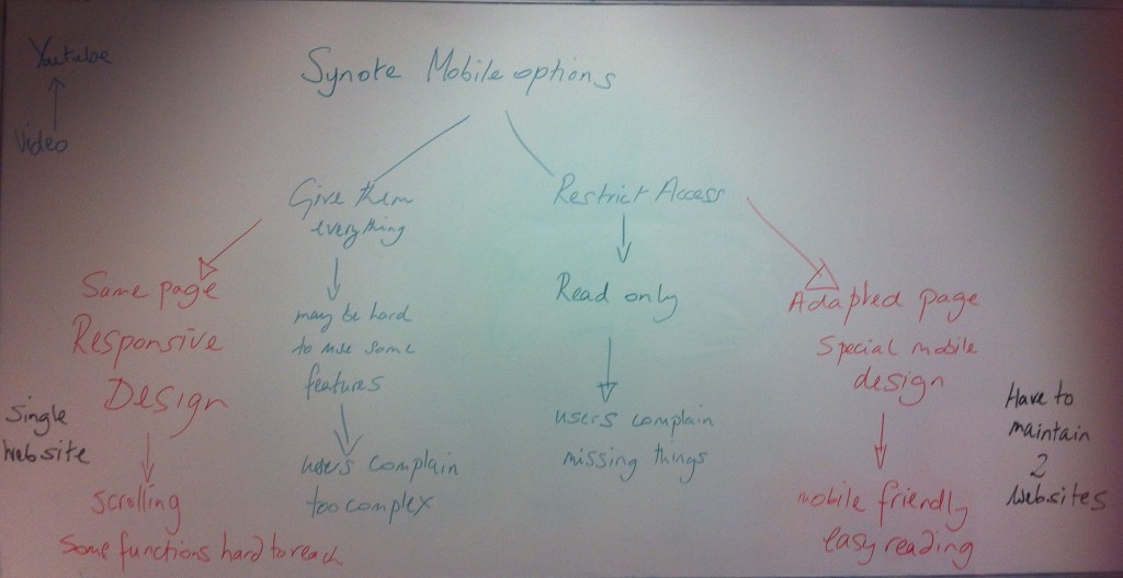
 Offer one website that is developed in a responsive manner – all the interactions would be available but some may be harder to achieve on a small screen.


