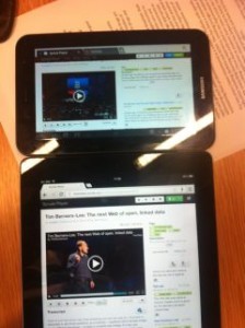
This meeting provided Yunjia with the first chance for a small group of users to provide feedback on the prototype of Synote Mobile using 7 and 9.7 inch tablets with Safari, Opera and Chrome browsers.
Yunjia is using CSS3 media query and viewing port size to decide when you are working with multimedia materials and how they will be displayed on devices – so it is hoped the user automatically experiences a comfortable presentation. In terms of Synote Mobile this means that when the viewing window is below 768 pixels the two columns that hold the transcript and synmarks (annotations) collapse into one. When a video or audio is played the synmarks will be on one tab with the closed captions allowing you to see the transcript across the window. The user can also choose just to read the transcript via that tab.
One issue that has been discovered by taking screen size as a method for changing presentation of videos and transcripts is that the CSS3 media query is dependent on screen size and videos are dependent on pixel widths. It is a tricky problem to explain as it appears that CSS media queries result in different behaviours for continuous media and paged media. There is also an inconsistency in behaviour across devices and browsers.
The controls are dependent on viewing modes, devices and browsers – so when using landscape mode on the iPad it senses that it is in desktop mode. When playing the video and viewing the transcript the player controls are always seen but when using Portrait mode the CSS media query senses the reduced width and represents the web page without the player controls as you scroll down. Yunjia says it is possible to solve the problem on some devices, but because this does not work for all devices it has been decided that ‘width’ is probably the best method for defining when the controls will be shown – Yunjia is using ‘Bootstrap’ from Twitter at present, which is considered the most consistent environment across all devices when it comes to presenting media data.
When discussing other user issues such as the look and feel, the Synote Researcher website used as the basis for viewing recordings was considered to be easy to use and attractive but there were one or two login issues on the iPhone.
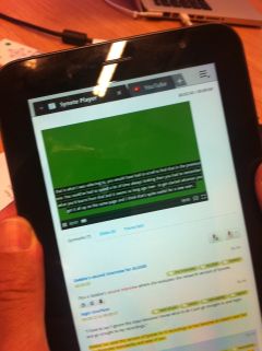
One user suggested that the highlights of synmarks (annotations) should be different from the transcript highlights as the video or audio plays – the example provided shows a YouTube video working with Synote Mobile.
 If there is a large chunk in the transcript when viewed on the video the caption will overlay too much of the picture. YouTube have set their automatic speech recognition captioning to always generate 2 lines – if the transcript is put in manually the size can be reduced to two lines for each timed section so it appears in a similar fashion but work is needed in this area to ensure this occurs in Synote mobile. It would be possible to edit the transcripts with an autosync system that divides longer sections into 80 character chunks that display as two lines. This cannot be done on the fly but would need to occur as part of the process in the database where the separate caption record is kept. This would not be necessary for audio as can be seen from the image as the caption can be displayed on a plain background.
The mobile phone version is still being adapted with single column viewing and the transcript appearing as captions – at present it has reached the viewing stage but not editing mode. A further meeting with the developer is planned on August 3rd, 2012


