It has always been difficult to have a full team meeting and our last meeting was no different, but by using the University of Southampton’s iSurvey system we have managed to get results to some of our questions. Moreover, through the use of face to face interviews, emails, calls and the blog we have gained an insight as to how to develop an Adaptable and Learnable User Interface for Analysing Recordings. Synote, for the researcher, has been developed into a freely available open source downloadable application that can be used by any individual, institution or organisation.
We believe that we have succeeded in producing improvements to the ‘existing user interface’ and adapted Synote as an “e-research tool, in order to make [it] easier to learn by non-specialist users.” (JISC Usability and Adaptability of User Interfaces) by using a co-design methodology with a very open approach to the project evaluation. The final sample video to illustrate its use is being produced and will be made available.
The complete agenda for the last meeting was mentioned in the last blog, but under the main points I have also provided an overview of some of the ideas and comments made throughout the project and during the face to face interviews. There is a final summary available at the end of this blog.
A service becomes a download with a new name
There was much discussion during the lifetime of the project about having to make a new version of Synote whilst leaving the original system intact. Synote was designed for the annotation of educational recordings with notes and transcriptions. The content has often been drawn from lectures, seminars, videos and audio available online. Recordings are not usually held on a specific server for Synote users. Users are required to use their own websites to provide the URL link to the Synote player. 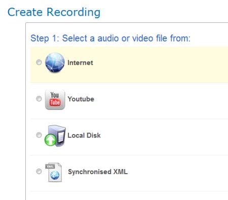 During the project we discovered that some users found it hard to make a URL from an uploaded recording and so the new version includes the ability to upload a recording from a desktop computer, to link to YouTube recordings, as well as users’ own websites.
This also led to the decision that the researcher version should be a download rather than held on the University of Southampton server for public use, as is the case with the original version. This decision was made because of the type of sensitive data that might be used by researchers. By having a download the software can be held on secure servers with increased data protection.
Finally, the fact that the new version had some enhanced features, meant that it needed an addition to its name! iSurvey was used for voting and although the name ‘Synote Scholar’ was liked by many members of the team – Mike was the final arbiter with the name Synote Researcher winning the day as he felt that the name ‘Synote Scholar’ could equally be seen to apply to the original version of Synote and so didn’t make it clear that the new version was designed for researchers!
Evaluation results related to the new interface design for learnability and usability.
Millard, D., Faulds, S., Gilbert, L., Howard, Y., Sparks, D., Wills, G. and Zhang, P. (2008) Co-design for conceptual spaces: an agile design methodology for m-learning. In: IADIS International Conference Mobile Learning 2008.
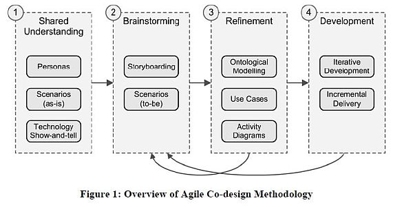
Throughout the project we used the blog to act as part of the evaluation process – publicising storyboards, changes made and slide views of the changing Synote Researcher using the agile co-design methodology mentioned at the outset. This allowed us to have an on-going conversation with users and other team members. It resulted in an iterative approach being taken to the development process and was very useful when monitoring changes.
We used John Brooke’s System Usability Scale (SUS) for a quick analysis of the views of users as to the usability of Synote Researcher. The results showed that there was an increase in the overall scores out of 100 from 48.50 to 67 with 4 out of 5 users agreeing in the second evaluation, that they felt “most people would learn to use this system very quickly” The score that brought the second evaluation down was the need for technical support to set up the system. This is not surprising and the download may need technical support.
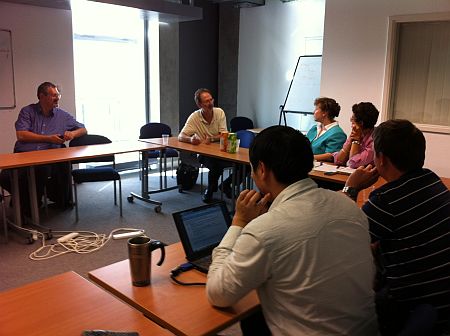
More precise evaluations were undertaken via a series of face to face interviews designed to see if the changes made had ensured that Synote was easier to learn and use by researchers wishing to analyse and code multimedia data. During the interviews users were asked to participate in practical exercises such as logging-in, searching for recordings, creating their own recordings and adding a transcript and synmarks or annotations. They were asked to comment throughout the meeting and offer a score of 1-5 for look and feel where 5 was excellent.
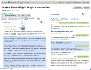
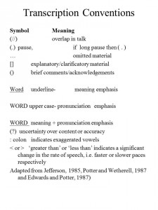
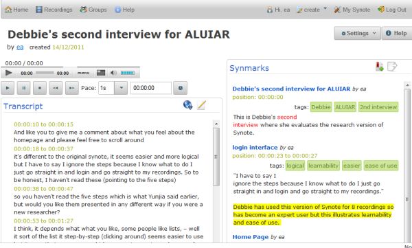 During the discussions background information about the possible use of the demonstrator was requested and how users views about the Synote service may have changed due to the redesign. The evaluation of the original Synote took place in June 2011 and the final appraisal occurred during November 2011. The interviews were also analysed using Synote Researcher with annotations and remarks as seen above.
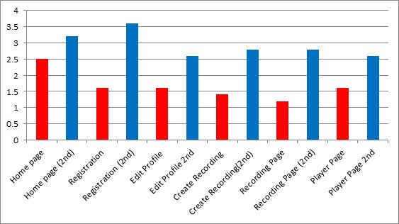
The results for scoring the individual pages were based on the users who completed both interviews although we had an additional three external users who commented on the new version. As there were some extra interviewees it was decided that an average of each score given for each page discussed would be taken over both interviews. As can be seen all the scores increased and this was despite ideas for further changes and constant iterations.
As a result of all the requests it was felt necessary to revisit the original work packages to check all the elements requested at the outset of the project had been discussed and included in the design. Only one of the requested changes was not possible to achieve in the time available as this would have involved a redesign of the whole Synote system.
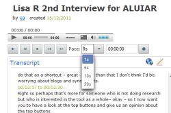 Greater flexibility of movement backwards or forwards through a recording (e.g. by typing in new time) as at present can only move in 5 second ‘nudges’ or move time slider or change speed if recording format and player allow. – Now able to nudge the recording forwards and backwards by 1,5,10 and 20 seconds.
- A drop-down box listing frequently used tags (e.g. for coding name of speaker and category code) – These appear as you add a tag to the annotation.
- Foot pedal control of player – This has been achieved and tested using a Start-Stop HDP-3S pedal from HTH Engineering Inc. The software has allowed us to allocate controls as per the original Synote keyboard shortcut accessibility options.
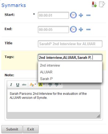
- When manually transcribing a recording it is possible to also annotate this with the
start time of the clip entered automatically but the end time needs to be manually entered. Synote allows a section of a created transcript to be selected and the annotation to be linked to that section with the start and end times of those sections to be automatically entered. It would make the system easier to use if it was possible to also do this without having first to save the transcript.. – This has been achieved with + and – keys plus an icon of the clock to indicate the inclusion of time as can be seen in the screen grab on the left. - Facility to download the annotation data (e.g. to Microsoft Excel for statistical analysis and charts and graphs or for a report or into other annotation tools). At the
moment the information requires copying and pasting – This has been achieve with a csv file with all the synmarks as can be seen in the picture above by the paper icon with the arrow at the top right.
- Making it harder to exit without saving and so losing changes made.- This has been achieved with an automatic save as draft and additional save on exit.
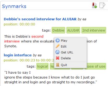
- Allowing the user to control the recording playback when annotating by providing
media player controls in the annotation window. (at present a user can annotate a
recording and the annotation can automatically read the time of the recording but the user cannot easily replay a section of the recording while writing the annotation) – this has been achieved through the use of the right hand mouse button.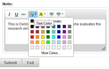
- Use of text font, colour, size and style for coding – this has been achieved as shown in the picture.
- Individual profiles provide a graduated learning curve to suit the preferences of each
particular researcher allowing fine-grained control over a wide range of settings (e.g. whether the replay of the video should pause automatically while an annotation is being created). – This has partly been achieved by the viewing of icons and supporting text only when moused over or selected or the use of the right hand mouse menu within the transcript or synmark section. - Redesign of interface to improve learnability – This can be seen when viewing all the attached images and downloading the software as well as the evaluation results.
- Organise recordings into groups and categories to make them easier to find and
manage – This has been achieved through the groups menu and sorting mechanism within the recordings listings. - Ability to replay just the video clip from a search (at present plays from the start time
and manually have to pause at the end time of the clip) – it has not been possible to achieve this in the time available as it would require a redesign of the whole Synote system.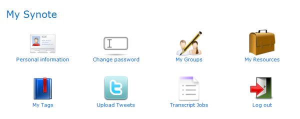
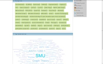 In addition to the changes made to many sections of the original Synote there has been the introduction of ‘MySynote’ – this is an area where the researcher can look at their own recordings, synmarks or annotations and tags used for coding as well as edit their profile. It allows for the sorting of recordings and the viewing of the most commonly used tags as a tag cloud.
Overview and discussion about the initial comments from interviews undertaken with the team and external evaluators.
Both Yunjia and I were very heartened to hear the comments made by interviewees including external evaluators who had seen or used the original Synote, and were now being introduced to Synote Reseacher. Even those who were using the new version commented favourably on the improved usability and learnability. Dr Sarah Parsons commented ” It feels a lot more intuitive and I think with some of those tweeks we have talked about in terms of labelling clear what a couple of those bits are would strengthen that even further, it feels very accessible to me….” Audio clip
 Debbie said about the home page “Thats easier. (pause) On the old one you had to find information you had to start searching you had to read the whole of the page of other information before you can necessarily find what you need to start the process. So this is much clearer.”
Changes to be made to the final iteration
The final changes as a result of the last few interviews are minor ones listed below
- Refine information on front page – Reducing and improving the presentation of the help slides.
- MySynote page to just have icons and names to match the list that appears on other pages.
- User Profile to contain registration / password information – the captcha is to be removed as this will not be necessary on the download.
- Users are going to be able to edit and delete their recordings.
- The Groups will work for sharing recordings with chosen users or setting up recordings in different categories.
- Legal statements will be added and a simple help file added.
Final Summary
We have been asked to
- Recap – what you set out to achieve, what you didn’t achieve, why?
- How successful have you been? What are your metrics?
- Lessons Learned?
It is hoped that this final blog has covered all these requirements as it was hard to divide the list into three separate blogs without considerable repetition. We set out to achieve a version of Synote that would suit researchers and be easy to use and learn. We hope we have been successful as well as providing a unique application that can:
- be freely used
- work quickly and easily on any desktop with access to the internet
- have web based data and multimedia for sharing research.
- use the data presented for evaluation, appraisal and supervision
- capture simultaneous conversations with similar timeframes
- colour code annotations
- tag themes and categories
- use titles of annotations for sorting.
- use a foot pedal to control the media player and other aspects of the interface
- use keyboard only input and screen reader access (Equality Act 2010)
- use speech recognition for re-speaking to speed transcriptions.
There is still the challenge of creating annotated clips from the recordings that automatically stop at the end of the clip – this was not possible to achieve in the time available as it requires a significant redesign of the Synote system
Rating our success through the use of various communication methods along with specific surveys plus interviews has provided us with a range of quantitative and qualitative data, despite the low number of users over the period of the project. The Nielsen Norman Group is often quoted as saying “The best results come from testing no more than 5 users and running as many small tests as you can afford.”
When it comes to learning lessons these can be summarised as follows:
- Allow more time than you think for evaluations – interviews and transcriptions
- Make sure you have at least one willing volunteer who is not working on the project on a day to day basis but is using it for research (in this case). We owe Debbie a great deal of thanks as she provided us with several insights that would have been overlooked by those of us who had become over accustomed to the way Synote worked.
- Have outside evaluators who are willing to comment on the old versions and trial the final iterations with a fresh look – Thank you Lucy, Ring, Sarah and Inga
- Have some expert researchers (in this case) who are willing to share their requirements early on in the timeline and compare the development ideas with what may be offered by other software programs – Thank you Lisa H, Lisa R and Mary
- Define your unique selling points so that you can persuade new users to adopt the new program – Thank you Mike, Lester and Gary
- Finally but most importantly – you need a good lead developer to change a program that has been developed by someone else, but also one who is willing to be endlessly patient and understanding when translating ideas into reality – Thank you Yunjia

