Category Archives: News

Final Posting with a link to Synote Researcher download.

During the final meeting we discussed some of the lessons learnt when thinking about usability and the development of online applications.  Here Yunjia, who is working on all things Synote, provides his reasons for finding that usability can be improved when there is direct liaison with users rather than working through a project manager or other members of the team. (View via Synote with keyboard access)

Download the latest version of Synote Researcher from SourceForge.


ALUIAR version of Synote undergoes final testing and evaluation

The final phase of the evaluation begins with our outside evaluator Dr Sarah Parsons,  kindly stepping in to help us with the discussion around this demonstrator for researchers and the work that has been undertaken by the team.  Below you can see a silent movie of the latest version of Synote with a transcription being added manually plus synmarks. This version will be available as a download from Source Forge.

We hope to have more samples captured via the resource itself once interviews get underway this week.  In this example you will see the JISC funded REALISE market place for open innovation and assistive technology being discussed – it has just received further sponsorhip from Devices for Dignity

Collaborating with Rave-in-Context and how our projects differ!

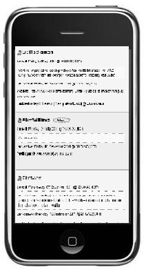
iphone mockupYesterday Liz Masterton and I sat down to discuss evaluations and Liz kindly showed me how her mock ups for the Rave-in-Context project templates would work on an iPhone, iPad and small laptop screen.  We looked at myexperiment and chatted about usability issues in particular how users would be able to access their research on a small screen phone!

Liz added to the Rave-in-Context wiki an extremely useful report on usability and mobile technologies with several links.

It is interesting to note the difference between adapting a service, such as myexperiment for a smaller screen and the issues around changing the use of a service as is the case with the ALUIAR project.   Here we are looking at a service really designed to house lectures and discussions with the ability to synchronise the transcription and comments as well as add slides and Twitter additions.  Now we want to make it into a service that will take coding conventions for researches, colour and font changes as well as allow easier uploading of files and export features.  Quite a step change from usability as well as a learnability point of view!

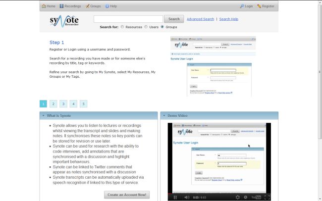
However, I felt that the ALUIAR project team was not only working in a similar way to Rave-in-Context,  with our story boarding but as has been stressed by users we have to make the service easy to learn and remember!   Hence our discussions around the 1 – 2 -3 – 4 -5 step approach to working through the various aspects of the Synote service. It is hoped this will help those new to Synote, but that the re-design of the interface is more usable and memorable so that returning after a lull in a research project is not a daunting task! Perhaps it could be equated to learning to drive a car – see below!

I then came across a Jeff Atwood’s 2005 blog on Usability vs. Learnability that had an interesting quote towards the end taken from Joel Spolsky’s book on User Interface Design for Programmers.

It takes several weeks to learn how to drive a car. For the first few hours behind the wheel, the average teenager will swerve around like crazy. They will pitch, weave, lurch, and sway. If the car has a stick shift they will stall the engine in the middle of busy intersections in a truly terrifying fashion.

If you did a usability test of cars, you would be forced to conclude that they are simply unusable.

This is a crucial distinction. When you sit somebody down in a typical usability test, you’re really testing how learnable your interface is, not how usable it is. Learnability is important, but it’s not everything. Learnable user interfaces may be extremely cumbersome to experienced users. If you make people walk through a fifteen-step wizard to print, people will be pleased the first time, less pleased the second time, and downright ornery by the fifth time they go through your rigamarole.

Sometimes all you care about is learnability: for example, if you expect to have only occasional users. An information kiosk at a tourist attraction is a good example; almost everybody who uses your interface will use it exactly once, so learnability is much more important than usability. But if you’re creating a word processor for professional writers, well, now usability is more important.

And that’s why, when you press the brakes on your car, you don’t get a little dialog popping up that says “Stop now? (yes/no).”

Meeting Minutes – 15/05/2011

Adaptable and learnable USer Interface for Analysing Recordings (ALUIAR)

synote guide1st meeting – 15/05/2011 Room 3073 Building 32 (Access Grid Room)

Attendees

Mike Wald, Lisa Harris, Mary Gobbi, Gary Wills, Sebastian Skuse, Yunjia Li, Lisa Roberts and E.A. Draffan (Apologies received from Lester Gilbert for his absence).

Minutes from the meeting

Welcome and Introductions from members of the team

Work packages were discussed and Mike gave an overview of the project with the features that were mentioned in the project plan and others that might be included in the design.

It was decided that there would need to be some API changes and storyboarding of possible interfaces for various functions (Yuniji and Seb).

Mary Gobbi suggested the idea of a ‘Decision Tree’ and methodological framework for the types of interviews undertaken by researchers and the type of coding, annotations etc needed for different types of research. It was felt this would help many people and also act as a guide when deciding which features could be added to Synote and which were left to other types of software supporting research and speech transcription such as NVIVO and Transcriber.

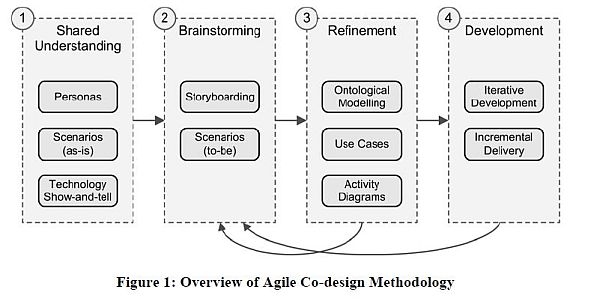
Co-Design – taking the diagram below as a guide to the process being undertaken it was decided that short interviews with a series of stakeholders would be noted and some recorded and uploaded to Synote as part of the shared understanding and show and tell aspect of the process.  (action EA with team members plus other researchers)
co-design diagram

Millard, D., Faulds, S., Gilbert, L., Howard, Y., Sparks, D., Wills, G. and Zhang, P. (2008) Co-design for conceptual spaces: an agile design methodology for m-learning. In: IADIS International Conference Mobile Learning 2008.

Website and future communication choice – The results of this work will be visible on Synote and linked to a blog on the ALUIAR project website – the team will have a mailing list and drop box account.  (action EA and Seb)

The next team meeting will be 11th July, 09.30 – 10.30 Access Grid Room, Building 32 Level 3.