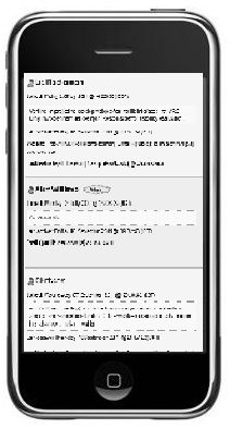
 Yesterday Liz Masterton and I sat down to discuss evaluations and Liz kindly showed me how her mock ups for the Rave-in-Context project templates would work on an iPhone, iPad and small laptop screen. We looked at myexperiment and chatted about usability issues in particular how users would be able to access their research on a small screen phone!
Liz added to the Rave-in-Context wiki an extremely useful report on usability and mobile technologies with several links.
It is interesting to note the difference between adapting a service, such as myexperiment for a smaller screen and the issues around changing the use of a service as is the case with the ALUIAR project. Here we are looking at a service really designed to house lectures and discussions with the ability to synchronise the transcription and comments as well as add slides and Twitter additions. Now we want to make it into a service that will take coding conventions for researches, colour and font changes as well as allow easier uploading of files and export features. Quite a step change from usability as well as a learnability point of view!
However, I felt that the ALUIAR project team was not only working in a similar way to Rave-in-Context, with our story boarding but as has been stressed by users we have to make the service easy to learn and remember! Hence our discussions around the 1 – 2 -3 – 4 -5 step approach to working through the various aspects of the Synote service. It is hoped this will help those new to Synote, but that the re-design of the interface is more usable and memorable so that returning after a lull in a research project is not a daunting task! Perhaps it could be equated to learning to drive a car – see below!
I then came across a Jeff Atwood’s 2005 blog on Usability vs. Learnability that had an interesting quote towards the end taken from Joel Spolsky’s book on User Interface Design for Programmers.
It takes several weeks to learn how to drive a car. For the first few hours behind the wheel, the average teenager will swerve around like crazy. They will pitch, weave, lurch, and sway. If the car has a stick shift they will stall the engine in the middle of busy intersections in a truly terrifying fashion.
If you did a usability test of cars, you would be forced to conclude that they are simply unusable.
This is a crucial distinction. When you sit somebody down in a typical usability test, you’re really testing how learnable your interface is, not how usable it is. Learnability is important, but it’s not everything. Learnable user interfaces may be extremely cumbersome to experienced users. If you make people walk through a fifteen-step wizard to print, people will be pleased the first time, less pleased the second time, and downright ornery by the fifth time they go through your rigamarole.
Sometimes all you care about is learnability: for example, if you expect to have only occasional users. An information kiosk at a tourist attraction is a good example; almost everybody who uses your interface will use it exactly once, so learnability is much more important than usability. But if you’re creating a word processor for professional writers, well, now usability is more important.
And that’s why, when you press the brakes on your car, you don’t get a little dialog popping up that says “Stop now? (yes/no).”
