A blog about “The Dirtiest Word in UX: Complexity” may not sound like something related to our work on Synote, but it came to me via the JISC Rave-in-Context group discussion list. There are nuggets of interest around usability and learnability and the acronym stands for ‘User Experience‘ design. Scroll down the page and you will find an interesting comment:
“Removing that layer of confusion to make the user’s goals easy to achieve means making things simple and clear. However, removing confusion doesn’t always mean removing complexity—it’s somewhat of a grey area. Sometimes complexity actually isn’t such a bad thing.”
Later the author writes…”Comparing the context and purpose to other sites reveals more about the apparent simplicity of Google. Google is a search engine whereas Yahoo! and MSN are Web directories—two different types of tool that require two different approaches to the UI.[2] Donald Norman explains why these other tools seem more complex than Google:
“Why are Yahoo! and MSN such complex-looking places? Because their systems are easier to use. Not because they are complex, but because they simplify the life of their users by letting them see their choices on the home page: news, alternative searches, other items of interest.[3]”
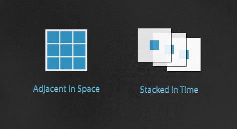
There is then a discussion around the concept of ‘Adjacent in Space and Stacked in Time’ by Edward Tufte
“Adjacent in space is taking elements of an application and positioning them all on the same screen. Depending on the information and number of features an application has, it can make the screen appear more, or less, complex…
Stacked in time is splitting the functionality up into several screens or layers, like a story being spread across pages in a book rather than crammed into a single long page… ”
The discussion for us is possible around another point…
“Using techniques like onboarding to simplify an experience are important, but should be carefully implemented. There should be consideration for the posture of the application or website. If the user is going to be using it often and for longer periods of time (sovereign), then the onboarding help should be able to be turned off or gradually be removed as the user grows. If users rarely visit and only for a short period (transient) this type of interface would continue to be helpful, rather than a hindrance.”

