New Interface and coding analysis – 5th Meeting Agenda

title slide for data analysisThe next meeting will be held on October 13th from 2-3pm in the Access Grid Room, Building 32 level 3.

Apologies

Mary Gobbi.

Agenda

  • Feedback from meeting with Torsten
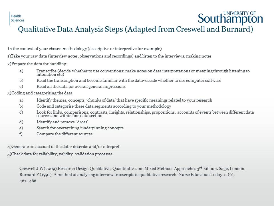
  • Data Analysis discussion  – Mary is unable to come to the meeting but as can be seen above and below she has kindly sent us her thoughts on a schema of data analysis for traditional transcriptions.
Qualitative Data Analysis Steps (Adapted from Creswell and Burnard)

Qualitative Data Analysis Steps (Adapted from Creswell and Burnard)

  • New interface presented by Yunjia  – Interview recordings from another project have been collected that will be used by E.A. to test the system along with any carried out by other researchers.  The evaluation phase will be discussed with times for meetings and further testing of the system.
  • Data Protection, Ethics and other legalities to be discussed
  • Foot pedal control
  • AOB and date of next meeting.

Collaborating with Rave-in-Context and how our projects differ!

iphone mockupYesterday Liz Masterton and I sat down to discuss evaluations and Liz kindly showed me how her mock ups for the Rave-in-Context project templates would work on an iPhone, iPad and small laptop screen.  We looked at myexperiment and chatted about usability issues in particular how users would be able to access their research on a small screen phone!

Liz added to the Rave-in-Context wiki an extremely useful report on usability and mobile technologies with several links.

It is interesting to note the difference between adapting a service, such as myexperiment for a smaller screen and the issues around changing the use of a service as is the case with the ALUIAR project.   Here we are looking at a service really designed to house lectures and discussions with the ability to synchronise the transcription and comments as well as add slides and Twitter additions.  Now we want to make it into a service that will take coding conventions for researches, colour and font changes as well as allow easier uploading of files and export features.  Quite a step change from usability as well as a learnability point of view!

However, I felt that the ALUIAR project team was not only working in a similar way to Rave-in-Context,  with our story boarding but as has been stressed by users we have to make the service easy to learn and remember!   Hence our discussions around the 1 – 2 -3 – 4 -5 step approach to working through the various aspects of the Synote service. It is hoped this will help those new to Synote, but that the re-design of the interface is more usable and memorable so that returning after a lull in a research project is not a daunting task! Perhaps it could be equated to learning to drive a car – see below!

I then came across a Jeff Atwood’s 2005 blog on Usability vs. Learnability that had an interesting quote towards the end taken from Joel Spolsky’s book on User Interface Design for Programmers.

It takes several weeks to learn how to drive a car. For the first few hours behind the wheel, the average teenager will swerve around like crazy. They will pitch, weave, lurch, and sway. If the car has a stick shift they will stall the engine in the middle of busy intersections in a truly terrifying fashion.

If you did a usability test of cars, you would be forced to conclude that they are simply unusable.

This is a crucial distinction. When you sit somebody down in a typical usability test, you’re really testing how learnable your interface is, not how usable it is. Learnability is important, but it’s not everything. Learnable user interfaces may be extremely cumbersome to experienced users. If you make people walk through a fifteen-step wizard to print, people will be pleased the first time, less pleased the second time, and downright ornery by the fifth time they go through your rigamarole.

Sometimes all you care about is learnability: for example, if you expect to have only occasional users. An information kiosk at a tourist attraction is a good example; almost everybody who uses your interface will use it exactly once, so learnability is much more important than usability. But if you’re creating a word processor for professional writers, well, now usability is more important.

And that’s why, when you press the brakes on your car, you don’t get a little dialog popping up that says “Stop now? (yes/no).”

Suggested Solutions to Synote ALUIAR Issues – 4th Meeting

The 4th meeting of the ALUIAR team was set up to finalise the storyboarding of the ideas suggested in previous meetings and to present the outcomes from the data gathering plus options for some functional solutions.

Those attending were Mike Wald(MW), Garry Wills (GW), Seb Skuse (SS), Yunjia Li (YL), Mary Gobbi (MG), Lisa Roberts (LR),  and E.A. Draffan (EA)

Apologies

Apologies were received from Lester Gilbert,  Lisa Harris and Debbie Thackray.

Mike opened the meeting with a discussion document related to the functionality issues discussed at the outset of the project and comments collected from initial interviews.   Accepted ideas are in red. 

  1. Greater flexibility of movement backwards or forwards through a recording (e.g. by typing in new time) as at present can only move in 5 second  ‘nudges’ or move time slider or change speed if recording format and player allow.

Possible Solution(s)

a) Enter time into time entry box and player will move to that time

b) Change ‘nudge’ time from 5 seconds to 1 second

c) Add additional ‘nudge’ time of 1 second as well as existing 5 seconds

d) If in editor and transcript text is selected for the editor text box then move player time automatically to the start Synpoint time

  1. A drop-down box listing frequently used tags (e.g. for coding name of speaker and category code)

Possible Solution:

Implement drop-down box listing frequently used tags. E.g.

a)    tags they have used on this recording

b)    tags anyone has used on  this recording

c)    in alphabetic order

  1. foot pedal control of player

Possible Solution:

Find available foot pedal that works or allows pedals to be assigned to keyboard shortcuts – Research the issues – EA to contact Hagger about suitable foot pedals

  1. When manually transcribing a recording it is possible to also annotate this with the start time of the clip entered automatically but the end time needs to be manually entered. Synote allows a section of a created transcript to be selected and the annotation to be linked to that section with the start and end times of those sections to be automatically entered. It would make the system easier to use if it was possible to also do this without having first to save the transcript.

Possible Solution:

If there is text in the editor text box then when selecting create, automatically enter both the start and end Synpoint times into the Synmark start and end times

  1. Facility to download the annotation data (e.g. to Microsoft Excel for statistical analysis and charts and graphs or for a report or into other annotation tools). At the moment the information requires copying and pasting

Possible Solution:

Add csv export for Synmarks and Transcript to print preview

  1. Making it harder to exit without saving and so losing changes made.

 Solution: Already done this in the current version

  1. Allowing the user to control the recording playback when annotating by providing media player controls in the annotation window. (at present a user can annotate a recording and the annotation can automatically read the time of the recording but the user cannot easily replay a section of the recording while writing the annotation)

Possible Solution:

Add the javascript player controls to the Synmark panel

  1. Redesign of interface to improve learnability

Possible Solution:

This is related to the current interface work and can be seen in the PowerPoint slide show below. 

  1. Organise recordings into groups and categories to make them easier to find and manage

Possible Solution:

Add tags to the title field

If categories were to be used they would have to be hard coded and not all the categories would be suitable.

  1. Ability to replay just the video clip from a search (at present plays from the start time and manually have to pause at the end time of the clip)

Possible Solution:

Using linked multimedia fragments – not feasible in the time scale

Additional Issues NOT in original Proposal

xiii Users find it difficult to understand how to store and link to their recordings in their own web space

Possible Solution: (Yunjia is currently investigating this) 

Allowing recordings to be uploaded into database rather than only being linked to in user’s own web based storage area

There then followed a presentation by Yunjia to show the work already carried out on the uploading of videos and audio recordings as well as changes that are happening to the interface. A discussion followed and the ideas were accepted.  The website is not public at present but below are a series of slides to show how the system is changing.

There was no other business and possible dates for the next meeting have been added to the Doodle Calendar for October.


ALUIAR Story Board

A quick story board has been designed to demonstrate the basic functions for a typical student/user. The slides illustrate views from the current Synote website with the first of the improvements requested in previous blogs. .

Scenario 1

A researcher wants to go to a group that has been set up by their research group and view/listen to another researchers recordings. The researcher has already registered as their university login grants them access to Synote.

Slide 1:

This is only slightly changed from the original. The interface has been complemented on its lack of clutter and easy to use at this stage. But as mentioned by evaluators, written instruction is now given to show users what exactly it is they are searching for in the ‘Google style’ search function. It was also decided that there should be an FAQ.  For the ‘look and feel’ the heading is being designed to be consistent across all pages of the Synote website.

Slide 2:

The login page is also largely unchanged. There is now help for choice that need to be made about the username and password, which was requested in the co-design sessions. There will also be a “have you forgotten your password?” link, so that users who forget their password can have it reset.

Slide 3:

This slide shows the look of the homepage once the user has logged in. Also it is noted that sometimes users have gone to ‘watch/listen’ to a recording before logging in and have been redirected to the login page, after which they always returned to the homepage. Should the login be successful, the login should redirect you to the last page visited.

Slide 4:

This page shows the list of groups that have been created in Synote. This design is what the “Users” list will look like (without the “shared” column). It was also discovered that the search at the top was not specific to the users/groups in the list shown, but it was a keyword search for the entire site. This should be changed so that users may use it to search content that is specific to the list they are viewing.

Slide 5:

This page shows a specific group’s page along with all of the recordings that have been shared within this group. In the current version, if you select the title of the recording it took you to a page that showed more information about it. This has been changed to a “More info” link. “Replay” has also been changed to “Play” to make it slightly clearer to users.

Slide 6:

This is the “More Info” page for a specific recording. This demonstrates a view that the creator would have of this page along with what they can do to this recording. This has been shown to illustrate that the page has its uses, but the navigation has been modified so that users who do not need to visit this page, do not do it unintentionally.

Slide 7:

This is the recording player page. This demonstrates a typical layout and highlights where all the control will now be on the page. It is hoped that by grouping the functionality on a small banner at the top, it will help make the advanced functionality easier to find and use. This is chosen over having functions surrounding each of the 4 sections of the page. The bar and the search box can also be minimised up to the top of the page so that more room can be generated on the screen if required.


Scenario 2

An individual wants to go to one of the research recordings they have published so that they can make some comments (i.e. synmarks) to it. He/ She will need to access them via their own profile.

Slide 1:

This is only slightly changed from the original. Written instruction is given to show users what exactly it is they are searching for in the ‘Google style’ search function. Once again there is the FAQ (as above) and the heading is consistent across all pages of the Synote website.

Slide 2:

The login page is also unchanged for the most part (as above). There is help for the username and password and the “have you forgotten you password?” link so that users who forget their password can have it reset.

Slide 3:

This slide shows the look of the homepage once the user has logged in. Also it is noted that sometimes users have gone to ‘watch/listen’ to a recording before logging in and have been redirected to the login page, after which they always returned to the homepage. Should the login be successful, the login should redirect you to the last page visited.

Slide 4:

This shows a view of a user’s profile, including their details, functions they can carry out on their profile and a list of all the recordings they have published. Next to each recording are the functions that the users may take for each of the recordings. This has changed from the original system in that all the information about a user and their activity is all accessible via their profile page.

Slide 5:

This is the recording player page. This demonstrates the view the creator will have of their own recording. All the functionality required to edit the recording can be found in its respective section of the page. The bar and the search box can also be minimised up to the top of the page so that more room can be generated on the screen if required.

Slide 6:

No changes are planned for the way Synmarks are made at present.

Scenario 3

This is just the beginning of the journey for the researcher wishing to find his own recordings (1), make some annotations (2) and link to a video (3) – the upload system has yet to be story boarded.

Slide 1

Slide 2

Slide 3
Tension between simplicity and complexity

A blog about “The Dirtiest Word in UX: Complexity” may not sound like something related to our work on Synote, but it came to me via the JISC  Rave-in-Context group discussion list.  There are nuggets of interest around usability and learnability and the acronym stands for ‘User Experience‘ design.  Scroll down the page and you will find an interesting comment:

“Removing that layer of confusion to make the user’s goals easy to achieve means making things simple and clear. However, removing confusion doesn’t always mean removing complexity—it’s somewhat of a grey area. Sometimes complexity actually isn’t such a bad thing.”

Later the author writes…”Comparing the context and purpose to other sites reveals more about the apparent simplicity of Google. Google is a search engine whereas Yahoo! and MSN are Web directories—two different types of tool that require two different approaches to the UI.[2] Donald Norman explains why these other tools seem more complex than Google:

“Why are Yahoo! and MSN such complex-looking places? Because their systems are easier to use. Not because they are complex, but because they simplify the life of their users by letting them see their choices on the home page: news, alternative searches, other items of interest.[3]”


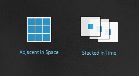
There is then a discussion around the concept of ‘Adjacent in Space and Stacked in Time’ by Edward Tufte


adjacent in space and stacked in time

“Adjacent in space is taking elements of an application and positioning them all on the same screen. Depending on the information and number of features an application has, it can make the screen appear more, or less, complex…

Stacked in time is splitting the functionality up into several screens or layers, like a story being spread across pages in a book rather than crammed into a single long page… ”

The discussion for us is possible around another point…

“Using techniques like onboarding to simplify an experience are important, but should be carefully implemented. There should be consideration for the posture of the application or website. If the user is going to be using it often and for longer periods of time (sovereign), then the onboarding help should be able to be turned off or gradually be removed as the user grows. If users rarely visit and only for a short period (transient) this type of interface would continue to be helpful, rather than a hindrance.”

Update on work in hand

Whilst going over the decisions made at the previous meeting it was clear that many issues were arising and Yunji mentioned that it would be helpful to divide up the concerns under Look&Feel  and Functionality.   The resulting picture developed with the priority being set to find an easier way of uploading media.

aluiar plan

Synote - possible changes

This is to be followed by a way of making it easier to work within the Player, first as someone who is just viewing, listening, annotating and exporting media and then, as a separate process, as one who edits and analyses media.   This is where the colour coding, conventions and more detailed transcript editing takes place.

The look and feel changes include a step by step approach beginning with instructions appearing on the home page.  Better filters for search and more guidance on other pages as the user progresses.  Page name changes and other items are going to be added as we work through each section in a similar fashion to the way the interviews were carried out.

Changes will be shown at the design stage on the blog so they can be agreed by members of the team and others using Synote.

2nd ALUIAR meeting, 11th July 2011

Those attending were Mike Wald(MW) Lester Gilbert (LG), Garry Wills (GW), Seb Skuse (SS), Yunjia Li (YL), Mary Gobbi (MG), Lisa Roberts (LR), Debbie Thackray (DT) and E.A. Draffan (EA)

Apologies

Apologies were received from Lisa Harris

Review of work to date

In the interim EA has met up with 5 Synote users (3 from the team) and collected the scores mentioned in the previous blog along with issues that particularly worried most researchers. More interviews are planned.

Synote page scores

Synote page scores 1-6 (excellent) completed by 4 users

There was a lively debate around these issues and it was agreed that the key problem was the uploading of media such as video and audio files ready for transcription. DT had had a particularly difficult time with her research material that needed to be secure as it related to patient data and setting aside an area which allowed DT to make a URL to go into the Synote ‘create recording’ area had proved to be quite difficult. YL agreed to look into this and help Debbie as well as plan a way of solving the problem – initially for Southampton researchers.

Uploading a file to a server and Synote

Uploading a file to a server and Synote

It is also possible to install Synote on an organisation’s server to solve the problem of sensitive data – MG has agreed to check the possibility of using a Virtual Private Network to access the department’s secure server. There was also the debate about using the ePrints API.

There needs to be guidance visible on the Synote interface such as clear steps for file uploads and better error and login feedback notification.


EA will contact Ed Fynn to help with easy guidance for uploading media files.

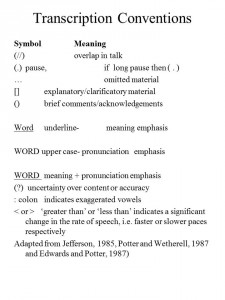
Transcriptions – Conventions

transcription conventions

Transcription conventions

MG provided the team with three documents to explain why it would be helpful to have some conventions available within Synote as well as the ability to colour code transcriptions.

Different colours for the various speakers may be difficult if required automatically.  Colours options for various themes was another request.
Synote can achieve the pausing in the annotations and comments


Terms and conditions – need to have different permissions for public and private data – check box.

Persona

miifigureThis persona (KT) has been built up from the comments gained from the interviews.

KT wishes to cut down the time spent on transcriptions when using Synote and finds the present design is hampering progress. Relatively accurate transcriptions  are required and a way of exporting  text and audio sections to make them accessible to all.  Ideally there needs to be a way of seeing who is speaking with colour coding and to be able to save annotations with some conventions to a different file format.   The annotations need to be tagged for the various themes and linked in some way to other interviews so that when a search is undertaken the various themes appear as a collection.  KT admitted finding the uploading of files difficult and felt that each time the system was visited there was some learning to be done!

Storyboarding new ideas for Synote

MG to storyboard qualitative methods and send them to us for plan views.
SS and YL to to storyboard initial interface ideas.

AOB

Holiday times discussed

Next Meeting

Doodle URL to be sent to the team.

Agenda for the 2nd ALUIAR meeting

The second ALUIAR meeting will be held at 09.30 on July 11th and the Agenda is fairly brief.

  • Apologies
  • Review of work to date
  • Transcriptions – Conventions – Mary Gobbi
  • Persona
  • Storyboarding new ideas for Synote
  • AOB
  • Next Meeting.

So far the results from the System Usability Scale (SUS) – “the ten-item attitude Likert scale giving a global view of subjective assessments of usability” (wikipedia) have given Synote a score of 50 where 100 is best.  The interviewees have also provided scores for the usability of several of the web pages that make up the service.   Score were 1 for hard to use/ awful  and 6 for easy to use / excellent – the average was 2.5 in terms of usability but many commented on the clean looking design. There is a clear need to improve the usability for researchers and the learnability.

The challenge is to solve the issues around comments such as these…

“Definitely not learnable!”  every time you go to it you have to think about it all over again – you have to work out where you are going all over again!”

“It looks nice but not very helpful… I still do not know what I am meant to be searching…. Or what do I do with the advanced search…. Why search when I need to create a recording?”

“Goes to Show recording and it does not click – but I can replay and I have not even seen it for the first time?”

” There seems to be some unnecessary jargon – don’t know what private, read write, tags?  Language – what is an XML file?  Automatic transcription? Raised expectations – press converter and magically it will do it all with no work?”

“What does the ID mean? – this does not actually describe what the recording is about – just says a name… you do not know what it is – but we are not looking for any of this as we want to create a recording.”

“Some of it is there… but you do know you have three steps and these should be clearly visible as per the Olympics – or booking a airline ticket on line”.

Thoughts about initial system evaluations

PlanningInterviews to find out what stakeholders feel about Synote, as it is at the moment, are well underway.   Initially we were going to record all the sessions, but as these seem to be extending to around 2 hours at times, I have been using Microsoft OneNote and a scoring system for each web page encountered of 1-6 as to how easy it is to use.  I would like to ask everyone to send me a short audio file that sums up the main comments made during the interview so I can add them to Synote for future comparisons.

In the meantime we have also introduced the System Usability Scale as a ‘quick and dirty’ way of scoring feelings about Synote.  I have set up an iSurvey questionnaire so everyone can use the online version if I have not asked you to fill in a paper based version.

I would like to take this opportunity for thanking those who have already taken part in early interviews and look forward to the remaining few.   I will be back to constantly update all aspects of the development of Synote as a research tool so we can story board the next stage.

Meeting Minutes – 15/05/2011

Adaptable and learnable USer Interface for Analysing Recordings (ALUIAR)

synote guide1st meeting – 15/05/2011 Room 3073 Building 32 (Access Grid Room)

Attendees

Mike Wald, Lisa Harris, Mary Gobbi, Gary Wills, Sebastian Skuse, Yunjia Li, Lisa Roberts and E.A. Draffan (Apologies received from Lester Gilbert for his absence).

Minutes from the meeting

Welcome and Introductions from members of the team

Work packages were discussed and Mike gave an overview of the project with the features that were mentioned in the project plan and others that might be included in the design.

It was decided that there would need to be some API changes and storyboarding of possible interfaces for various functions (Yuniji and Seb).

Mary Gobbi suggested the idea of a ‘Decision Tree’ and methodological framework for the types of interviews undertaken by researchers and the type of coding, annotations etc needed for different types of research. It was felt this would help many people and also act as a guide when deciding which features could be added to Synote and which were left to other types of software supporting research and speech transcription such as NVIVO and Transcriber.

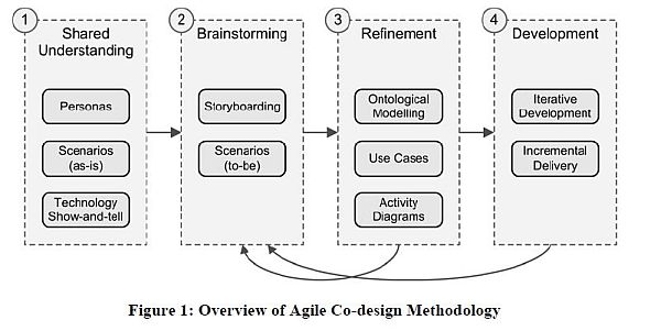
Co-Design – taking the diagram below as a guide to the process being undertaken it was decided that short interviews with a series of stakeholders would be noted and some recorded and uploaded to Synote as part of the shared understanding and show and tell aspect of the process.  (action EA with team members plus other researchers)

co-design diagram

Millard, D., Faulds, S., Gilbert, L., Howard, Y., Sparks, D., Wills, G. and Zhang, P. (2008) Co-design for conceptual spaces: an agile design methodology for m-learning. In: IADIS International Conference Mobile Learning 2008.

Website and future communication choice – The results of this work will be visible on Synote and linked to a blog on the ALUIAR project website – the team will have a mailing list and drop box account.  (action EA and Seb)

The next team meeting will be 11th July, 09.30 – 10.30 Access Grid Room, Building 32 Level 3.