Designer’s Dilemma: Availability and Meaningfulness of Numbers
Taken from The Trace Center (University of Wisconsin)
Accessible Design of Consumer Products
“In trying to make products more accessible, the question of numbers quickly arises. How large should lettering be? What size button is large enough? How much pressure is too much, or not enough? In trying to make designs more accessible there are two tough principles that one has to come to grips with early.
- You cannot make a product absolutely accessible. You can make it more accessible, but there will always be people who cannot use it.
- Therefore… There are no magic numbers. There are no numbers to tell you that you have gone far enough and nothing more will help anyone.
At first this is hard to accept. Everyone wants a number to design to. Occasionally minimal numbers for minimal required accessibility are set, but …
- They only can be set for a particular type of device (a phone, an elevator button, etc.).
- Such numbers are not possible for a set of general guidelines such as these, which relate to all products and all disabilities. What should be specified as the “ideal knob size” in a set of guidelines that covers wristwatches, kitchen stoves, and Walkman™ stereos?
- They only specify a minimum accessibility threshold (usually required by law or regulation).
They always leave someone out that should be accommodated if possible in a particular product design.”
John Gill has a very comprehensive set of web pages that cover
Guidelines for the design of accessible information and communication technology systems
“These Guidelines are written for designers of information and communication technology (ICT) and provide advice and recommendations on accessibility issues for all types of disabilities. They have corresponding quick-look checklists that show the recommendations made for various types of disability.”
There are many sites that offer advice about web accessibility and usability.
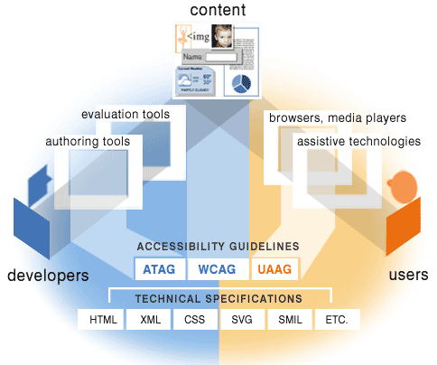
“It is essential that several different components of Web development and interaction work together in order for the Web to be accessible to people with disabilities. These components include:
- content – the information in a Web page or Web application, including:
- natural information such as text, images, and sounds
- code or markup that defines structure, presentation, etc.
- Web browsers, media players, and other “user agents”
- assistive technology, in some cases – screen readers, alternative keyboards, switches, scanning software, etc.
- users‘ knowledge, experiences, and in some cases, adaptive strategies using the Web
- developers – designers, coders, authors, etc., including developers with disabilities and users who contribute content
- authoring tools – software that creates Web sites
- evaluation tools – Web accessibility evaluation tools, HTML validators, CSS validators, etc.” (W3C WAI)
Web Accessibility WCAG Theme Song (YouTube Video with captions)
The rest of this page links to the Web2Access website that provides users, researchers and developers with a resource for reading about the accessibility of existing Web 2.0 services. It also provides a series of checks for reviewing new software and web services for accessibility. The test results are added to the database and once checked by the team, they go live for others to see.
Accessibility and Ease of Use
The check points allow you to evaluate key accessibility areas of a service or product. Anyone can use this evaluation system.
Remember making the documents users download from a web site accessible is also important.
Check-lists and tests for individual parts of a service are not an ideal way to address the issue of how easy it may be to use on-line materials or software – try to think holistically and perhaps use the JISC TechDis Accessibility Passport Generator.
“The Accessibility Passport is a way of creating a focused dialogue between the developers and the users of online resources.
It offers developers a way of explaining how they have taken accessibility and inclusion into account in designing learning materials. It also offers users and practitioners a way of giving feedback on how effective the mechanism has been.”
Web 2.0 Services References
- W3C Web Content Accessibility Guidelines 2.0 (WCAG), despite some reservations.
- Web Accessibility Group (University of Washington).
- The JISC TechDis Online Accessibility Self Evaluation Service (OASES)
- WebAIM.
Application References
- Centre for Excellence in Universal Design (CEUD) Guidelines.
- IBM Guidelines.
- The Voluntary Product Accessibility Template(VPAT) for Section 508.
- ISO standards, as used by Becta in their guidance to industry and developers.
Tools
- AIS Web Accessibility Toolbar for Internet Explorer and Web Accessibility Toolbar – for checking web site accessibility: document structure, colours, HTML, CSS, links, images …
- Mozilla Firefox with
- WebbIE text-only browser.
- Zoom features in major browsers.
- Colour Contrast Analyser and VisCheck.
- Thunder or NVDA screen reader (see Marco’s Accessibility Blog).
- Built-in operating system tools
- Windows Ease of Access Center
- Mac OS X Accessibility includingVoice Over.
- Using NVDA to Evaluate Web Accessibility
- Use of the keyboard (testing without mouse input).
Please visit the Web2Access Tests Page for more information.
Testing your Website or Software
The following list shows the range of accessibility tests that you can use to test your website or software, along with links to their respective Web2Access page that will show you the techniques that are employed to test each criteria.
Web 2.0 Service Tests
- Login, Signup and Other Forms Accessible
- Image ALT Attributes
- Link Target Definitions
- Frame Titles and Layout
- Removal of Stylesheet
- Audio/Video Features
- Video/animations – audio descriptions
- Appropriate use of Tables
- Tab Orderings Correct and Logical
- Page Functionality with Keyboard
- Accessibility of Text Editors
- Appropriate Feedback with Forms
- Contrast and Colour Check
- Page Integrity when Zooming
- Text size, style, blinking elements and Readability
Application Tests
- Built in accessibility checks
- Application works with External Assistive Technologies
- Text or other alternatives for image elements.
- Keyboard / Alternative input with focus
- Labels for objects, fields or controls
- Audio alerts have visual cues
- Alternatives for Video / Animation
- Media events offer user control
- Textual Information for screen reader
- Keyboard shortcut keys offered
- Save user preferences for style and zoom
- Timed events can be altered
- Change colours and contrast
- Uniform and standardised presentation
- Documentation
For more advice and guidance have a look at this list of web design references compiled by University of Minnesota Duluth – it is long!


