Fadwa ALRowais is researching the use of a framework that is aimed at helping those developing software in the Arabic language to be more aware of issues that might arise for those who have Dyslexia. This is proving very helpful in general terms for those of us who do not speak, read or write the language.
Navigation features
 One navigational requirement says: ” Ensure that data entry, data display and navigation controls are consistent in direction (for example, in Arabic interface data entry for textual content should be from right to left, for numeric content from left to right and navigation controls for the next screen should point towards the left and for the previous screen point towards the right).
![]() Should the reset page icon on ATbar stay with an arrow heading left or should it be reversed as its intent is to send you back to an original look?
Should the reset page icon on ATbar stay with an arrow heading left or should it be reversed as its intent is to send you back to an original look?
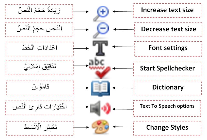
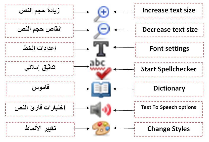
Whilst work goes ahead to make the toolbar and its menus read from right to left we want to ensure that all icons are correct and are representative of their functions.
 What happens when you linearise a web page for easier reading in Arabic – it should go from right to left but this will only happen if you are using the Arabic version of the ATbar. Reading ahead you will see some discussion about justification and this can be done via the CSS (Cascading Style sheet file) on the ATbar website and also under the colour changes plug-in.
Text to Speech issues
It has been hard to find a localised text to speech (TTS) engine as voices in Arabic appear to only exist in Standard Arabic and the language spoken on a daily basis differs from the language used in education and in formal writing.
Localisation apart there is also the concerns about the way the text is read not just the type of voice. Whereas in English there are clear word margins and punctuation to help the TTS engine, in Arabic there are two types of spacing – the word boundary space and spaces that can occur within a word. Accurate pausing and intonation patterns are harder to achieve with synthesised voices in this case.
Website Content
Cultural aspects of the language that impact on help files and instructions – There is the need to have separate dialogues for each gender because the Arabic language is a gender specific language (for example, the word (رَسَمت) /rasamat/ which means ’draw’ is used to refer to the female, while the word (رَسَمَ) /rasama/ is used to refer to the male). In fact many sites use the male version, but this is something we need to consider when working on training materials in particular.
Fonts that are easy to read are important such as Arabic Transparent and Simplified Arabic Fixed, avoiding angular font types such as Koufi and Andalus. In the case of the ATbar site Helvetica neue was chosen in sans serif style. However, we have also been advised that whenever possible it is important to offer automatic diacritization so the appearance of diacritics can be controlled with options for full diacritics, partial diacritics and no diacritics. The use of partial diacritics with Arabic script is better than no diacritics,because those who are dyslexic may be depending on the diacritics for phonological assistance via their visual clues. An example of this occurs when discussing ‘tanween’ /n/ formatted as a diacritic, to distinguish between root word ending with letter ‘n’ and sound /n/ produced by diacritics at the end of word (for example: /n/ at the end of the word (لُبْنَان) /loobnaan/ is different from /n/ at the end of the word (لَيْلٌ) /lailon/).
When it comes to Arabic text alignment the advice is to use right-justified or fully-justified text. In full-justified mode, Arabic orthographies use connectors (kashida) elongating specific characters of the cursive script without producing extra white space between words as in English texts. Fully-justified Arabic text has been reported as being useful for better recognition of letters and attached diacritics as well as offering visual help when reading from right to left and moving from top to bottom through the lines.
We are hoping we can improve our web pages and the toolbar to illustrate as many of the guidelines as possible. More guidelines will follow as the framework is developed. Thank you Fadwa.


