Category Archives: Uncategorized

Synote mobile phone testing

Synote mobile meeting

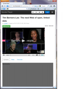
Testing with the mobile phone  version of Synote is proving exasperating!  The different devices, operating systems and browsers all produce different results despite the fact that the pages have been designed in HTML 5 with media element js player and jQuery mobile.  The transcript, synmarks and the PowerPoint slides all appear to display in the same way on the various browsers and devices.

 BUT …

Issues arising with videos and the media element js player have caused several headaches.  The way YouTube videos are presented  on iOS 5 (iPhone) where the controls work but the video is launched in the iOS player  and Android where there are variations in the software used on different phones e.g. some HTC and Sony phones.   On the latter the video is seen but cannot be played using an Opera browser but will play in the built in Android webkit browser – on the former an error message appears within the Chrome browser as it cannot load the player.  There is no mobile Firefox for HTC Wildfire.

The HTC OneXL with a 4 inch will run  Synote Mobile  in the same way as the tablet and desktop version.

Audio is not a problem as the transcript can appear below the player in this case.  Synmarks can also be seen with a separate tab.

Planning ahead
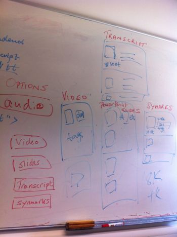
whiteboard designThe view of the video page will have titles, tags and description – the options page will allow the user to go to the video or audio page, transcript, slides or synmarks.  The transcript has the thumbnail picture from  the video and the start and end times for each transcript block.   The slides can be displayed in a row or line with start times and actual slides, the synmarks are listed with title, description and tags plus start and end time and a thumbnail of the YouTube video for that time.

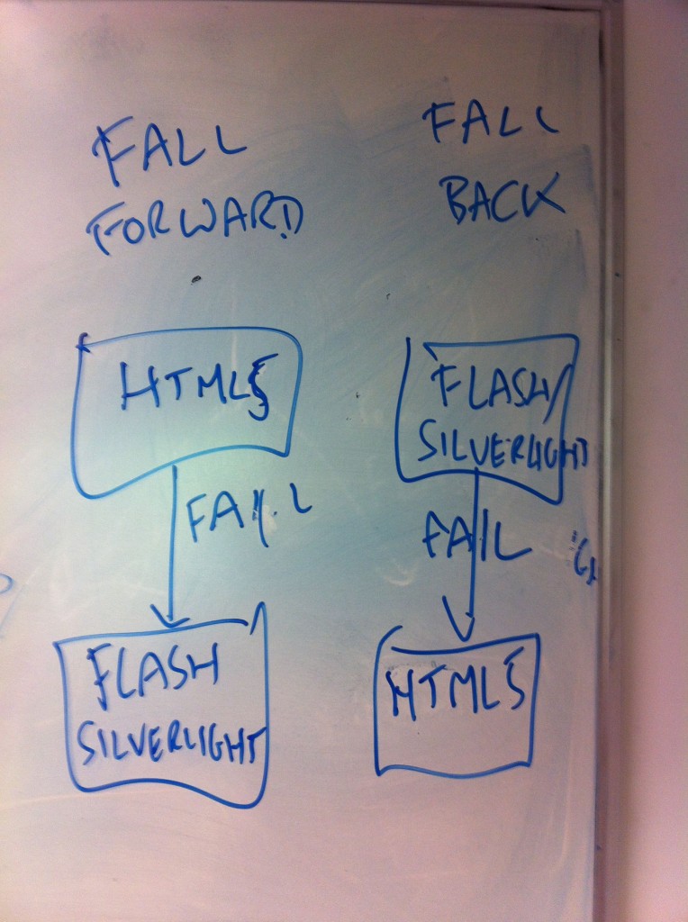
At present there is also a huge variation between the way mobile phones show the captions as taken from the transcript (as seen in the tablet version) because the players (whether built or in the browser) react differently to the selection of the caption button.   This is a testing phase and we are trying to see if there is anyway to overcome this issue.   If you use a Flash player on the HTC Wildfire it will display the captions  but this does not help us with HTML5! At least we know there is a fall back player that will cope with closed captioning on Android

Testing with the iPhone – it did not matter whether we used Chrome, Opera or Safari the player once launched just would not play the YouTube closed captions despite having closed caption settings on.  This appears to be a known problem as mentioned in the blog “YouTube – Apple’s Lack of Caption Support

Feedback on prototype Synote Mobile

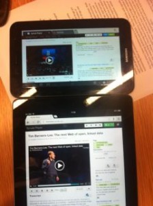
comparing Galaxy and iPad presentation of Synote mobile

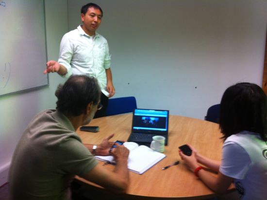
This meeting provided Yunjia with the first chance for a small group of users to provide feedback on the prototype of Synote Mobile using 7 and 9.7 inch tablets with Safari, Opera and Chrome browsers.

Yunjia is using CSS3 media query and viewing port size to decide when you are working with multimedia materials and how they will be displayed on devices – so it is hoped the user automatically experiences a comfortable presentation. In terms of Synote Mobile this means that when the viewing window is below 768 pixels the two columns that hold the transcript and synmarks (annotations) collapse into one. When a video or audio is played the synmarks will be on one tab with the closed captions allowing you to see the transcript across the window. The user can also choose just to read the transcript via that tab.

One issue that has been discovered by taking screen size as a method for changing presentation of videos and transcripts is that the CSS3 media query is dependent on screen size and videos are dependent on pixel widths. It is a tricky problem to explain as it appears that CSS media queries result in different behaviours for continuous media  and paged media.  There is also an inconsistency in behaviour across devices and browsers.

The controls are dependent on viewing modes, devices and browsers – so when using landscape mode on the iPad it senses that it is in desktop mode. When playing the video and viewing the transcript the player controls are always seen but when using Portrait mode the CSS media query senses the reduced width and represents the web page without the player controls as you scroll down. Yunjia says it is possible to solve the problem on some devices, but because this does not work for all devices it has been decided that ‘width’ is probably the best method for defining when the controls will be shown – Yunjia is using ‘Bootstrap’ from Twitter at present, which is considered the most consistent environment across all devices when it comes to presenting media data.

Synote Researcher website

When discussing other user issues such as the look and feel, the Synote Researcher website used as the basis for viewing recordings was considered to be easy to use and attractive but there were one or two login issues on the iPhone.

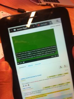
One user suggested that the highlights of synmarks (annotations) should be different from the transcript highlights as the video or audio plays – the example provided shows a YouTube video working with Synote Mobile.

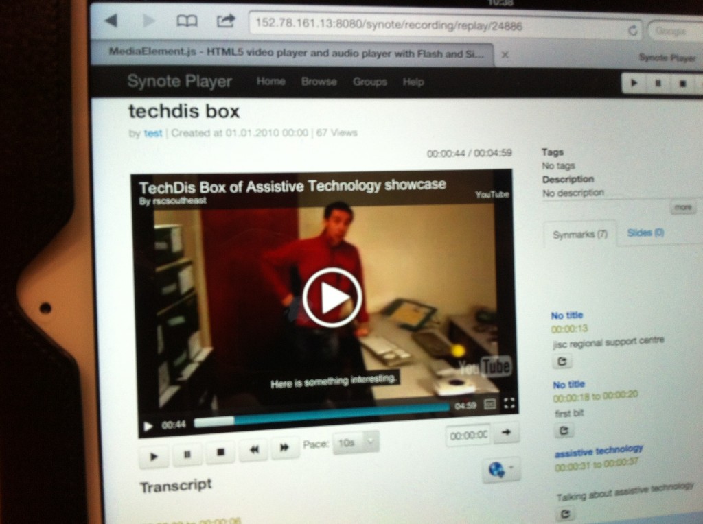
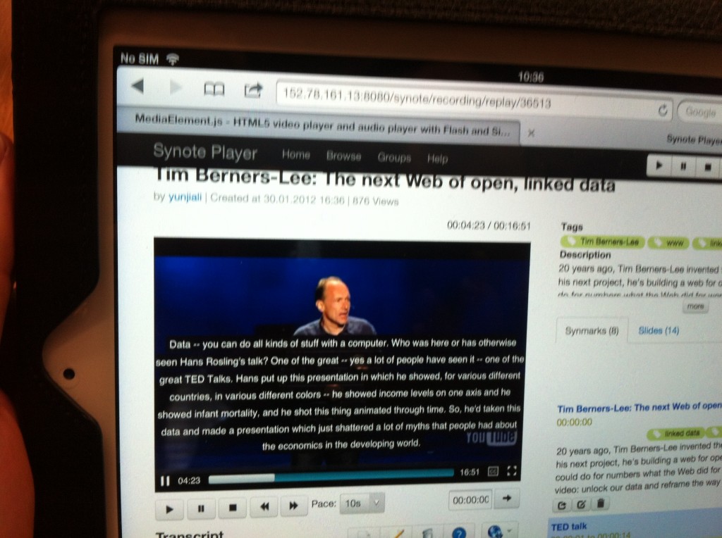
Synote Mobile closed captionsIf there is a large chunk in the transcript when viewed on the video the caption will overlay too much of the picture. YouTube have set their automatic speech recognition captioning to always generate 2 lines – if the transcript is put in manually the size can be reduced to two lines for each timed section so it appears in a similar fashion but work is needed in this area to ensure this occurs in Synote mobile. It would be possible to edit the transcripts with an autosync system that divides longer sections into 80 character chunks that display as two lines. This cannot be done on the fly but would need to occur as part of the process in the database where the separate caption record is kept. This would not be necessary for audio as can be seen from the image as the caption can be displayed on a plain background.

The mobile phone version is still being adapted with single column viewing and the transcript appearing as captions – at present it has reached the viewing stage but not editing mode. A further meeting with the developer is planned on August 3rd, 2012

Responsive Design – Minutes from the 3rd team meeting

As mentioned in the previous blog this meeting was attended by Dr Mike Wald, Yunjia Li and E.A.Draffan – Gary Wills sent his apologies.

Responsive Design

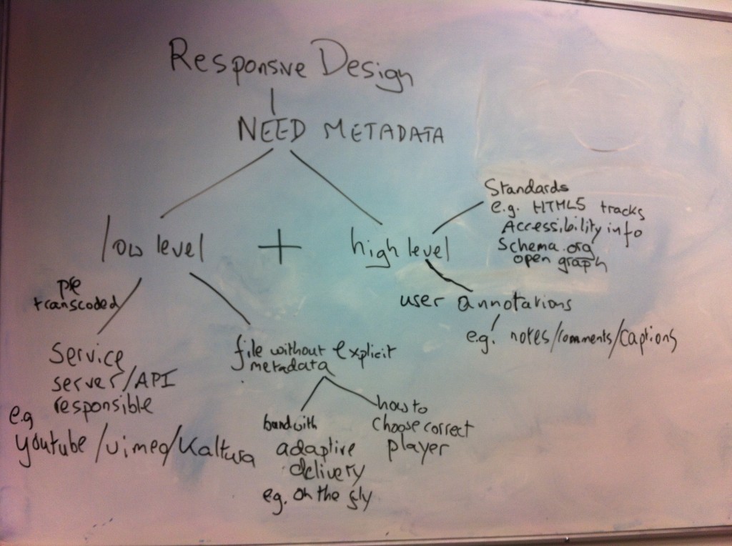
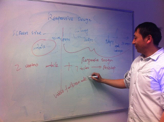
responsive designIt all started on the white board where Yunjia explained how he was adapting his design to fit with the problem of 7 inch plus screens versus the average smart phone screen.  He demonstrated the ever narrowing of the viewing area and how the video, annotation and transcription windows could shrink and eventually offer access via tabs.  But when it came to mobile phone users there was a need to rearrange the view to be totally linear.  In other words two versions of Synote mobile but with changes that would happen automatically depending on the metadata received.

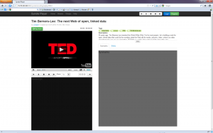
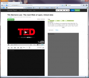
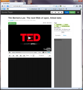
Here are four views of Synote mobile on the different sized screens

1200 and above

Screen size 1200 pixels and above

screen size 980 to 1200

screen size 980 to 1200

screen size 768 to 979

screen size 768 to 979

screen size 480 to 767

screen size 480 to 767

It will be very important to gather the metadata from the media so that the correct view and player can be selected. At present there are 3 useful approaches for this demonstrator – ffmpeg and YouTube has an api with metadata such as title, resolution etc  and finally the link to the file format itself offers metadata which can be drawn out by a commercial service and this would need to be re-created if we did not want to pay for the service.  The minimum amount of data needed is the duration of the media, the format and coding and whether it is video or audio.

It just so happened that there was a blog on this subject that fitted the discussion around screen size issues. Titled “What’s next for mobile now that adaptive design has failed?” it seemed like an appropriate article to read before the meeting.

“Desktop web browsers, tablets, and mobile devices are fundamentally different and are used in very different ways. Across our properties at CBS Interactive, we have experimented with a variety of adaptive and direct designs and are learning the hard way that a one-size-fits-all solution delivers a subpar user experience.” Peter Yared (VentureBeat MobileBeat blog)


 Annotations / Captions

diag of mobile interface

caption illustrationCaptions can be displayed on a desktop with the video but there appear to be no standards for displaying captions within web pages across all  tablets and mobiles alongside transcriptions and annotations.

At present if someone is deaf they have to read the caption and watch the video and then scroll down to the note taking mode.  It is not possible on the iPhone to display both the transcript window and the video due to the size of the screen.  However, it will be possible to capture an image from the video  and annotate this as part of the note taking process.

3rd Team Meeting – Wednesday 23rd May, 2012

wireframe lightbulbThis month seems to have gone by rather quickly and this team meeting will be a small one with Dr Gary Wills away at the moment.  Dr Mike Wald, Yunjia Li and E.A Draffan will meet to hear about Yunjia’s “responsive design for Synote Player and the pages he will be presenting using wireframework’.

He has set the discussion going with the following statement:

“This project will use basic principles of responsive web design to create a new mobile HTML5 version of Synote, able to replay Synote recordings on any student’s mobile device capable of connecting to the Internet.”

Item 2 will be how this is achieved on the various sizes monitors such as those offered on the iPad, Galaxy Tab and iPhone etc.

Item 3 will include the issues that have arisen with the player and being able to read annotations simultaneously whilst watching videos.

As Dr Mike Wald said in a recent email to the team “One issue with captioning overlayed on the video (as suggested for Synote Mobile)  rather than in a separate panel (as we have currently in Synote) is how can a hearing impaired person read the captions when the video is a thumbnail or not displayed at all?  There needs to be a way the captions can be displayed separately … Matterhorn designers are now thinking about ways to do this  …


Beautiful mobile applications, beautiful user experiences Part 3

Whilst exploring issues around the look and feel of Synote Mobile Mike sent me this blog, which is one of three from The Computer Weekly Application Developer Network

“In part three of this guest blog for the Computer Weekly Developer Network, Sybase technical evangelist and mobile evangelist Ian Thain discusses the new mobile application landscape characterised by new and more beautiful user interfaces.

Links to part one and part two of this series.

There are a few mobile design guidelines that should never be far from your thoughts.

To take a few as examples :-

  • The initial screen should be kept as clear as possible to act as a launch point, because first impressions count – Synote has always gone for the minimalist approach! 
  • Keep the main/primary controls in the thumb ‘hot zones’ at the edge of the screen and keep the most important content at the top, with controls at the bottom – this is particularly important for screen reader users who often track their fingers around the edges of phone screen to catch menu items.ITSmallPR.jpg
  • Be generous with the space on the screen, do not crowd and avoid scrolling where you can. Reducing clutter helps everyone but in particular disabled users as does the following point. 
  • Stick to proven navigation models, which can be used in combination, use flat pages for simple applications, and if possible make use of a tab bar that switches between the app’s main functions, and/or a tree structure for drilling down through a hierarchy of content.”

Please read the rest of the actual blog if you are interested.

Research – Streaming videos onto mobile phones

Since the OER meeting we have been exploring the issues around streaming video on mobile phones and tablets. It appears the latter is easier than the former! We have also been exploring all the web pages of those we met up with at the meeting to see how we can collaborate to stream data from these sites into Synote Mobile but more on that later!

The state of HTML 5 and video is well explained by LongTail Video and it looks as if this is the way to go when one wants to deliver a cross platform service. However, there are issues around fullscreen viewing with iPhones as the video is not presented within the webpage so is no longer browser based as can be seen from the BBC news screen grabs taken on an iPhone 4S.

BBC News iPhone screen captureBBC video iPhone screen capture

This fullscreen issue makes it impossible to add captions unless they are included when the video is made.  Closed captioning is explained by Longtail video.com with the support provided by JWPlayer and it is clear that external files will be unable to be read with the method presently used by iPhones for rendering videos.

There are several pros and cons when researching the different HTML 5 players and the methods they use to support captioning.  A recent blog on Salt Websites offers several options, but the author has come to the same conclusion that we have reached namely:

“Now after all this effort to get your videos working on iOS I have to give you the bad news – the iPhone does not show subtitles! They put the video into full-screen mode and ignore the subtitles. ”


The gauntlet has been thrown down …

gauntlet thrown down

Research – Planning for an easy to use and accessible mobile app.

iPhone accessibility

Link to Apple accessibility web pages

Mobile apps have huge potential to help and liberate people, including disabled people and the elderly, who face challenges with other methods of communication. But as with other new technologies, there is also the potential to further exclude people who are already at a disadvantage by providing small, hard-to-use, inflexible interfaces to devices and apps that create more problems than they solve. (One Voice – Moving Together)

One of the main problems this project will need to overcome when considering ease of use and accessibility is the multitude of portable devices and operating systems. The use of a common code such as HTML 5 may overcome some of the difficulties rather than choosing to program a device dependent native app.

Jakob Nielsen’s Alertbox, September 26, 2011 provides some research into usability with an update on the subject pointing out the need to be aware of ‘fat finger syndrome’ and limit the number of features available. 

When it comes to usability testing, User Centric provide some key pointers that link to co-design and testing prototypes to ensure ease of use. There are answers to the following questions:

  • Does a fully functional prototype have to be built before user testing?
  • Should the user’s device be tested or is it better to provide a device?
  • What devices and user groups should be tested?
  • Are there differences between iPhone and Android users?
  • Do both need to be included in a study?
  • When is lab testing versus remote testing appropriate?

W3C have produced some Mobile Web Best Practices (MWBP) guidelines for developers that are relevant to HTML 5.  There are also the British Standard 8878 guidelines as presented by Jonathan Hassell – BS 8878 in 88 seconds – a lightning summary of the Standard (video with captions and transcript) provides a gallop through of the process!

Perhaps the easiest check list comes from the One Voice for Accessible ICT Coalition

The suggested seven steps are:

  1. Learn about accessibility.
    Learn how a user with a disability may use your app.
  2. Quick accessibility check.
    Get an estimate of how accessible you app is now.
  3. Publish an Accessibility Statement.
    Express your intent to be accessible.
  4. Provide a Contact Us function.
    Enable users to tell you easily about accessibility issues.
  5. Ensure reading sequence is logical and comprehensible.
    Ensure page navigation is simple.
  6. Create a user interface that is easy to understand and operate.
    General usability is an underpinning of accessibility.
  7. Ensure text formatting can be altered.
    Allow users to read text using a size and theme that meets their requirements.
Andoid Accessibility Features

Link to IDEAL Group's Android Accessibility Project


There is no such thing as full accessibility for everyone, but that should not stop app developers from attempting to maximise accessibility. (One Voice: Moving Together)

1st Team Meeting – 22nd March 9-10am, 4th floor demo room/FPAS board room 32/4073

This will be the first meeting of the team to discuss:

  • Design and development of the Synote web app suitable for mobile technologies
  • Conversions of permitted recordings to suit the mobile platform
  • Issues related to media types, transcriptions and annotations.
  • Preparation for OER 3 Programme Meeting being held on 26th March 2012 at Dexter House, London
  • AOB
  • Next meeting date.

Welcome – Aims of the Synote Mobile Project

Synote Mobile will meet the important user need to make web-based Open Educational Resources recordings easier to access, search, manage, and exploit for learners, teachers and others.

  • Synote recordings are available as OER
  • Synote is Open Source and freely available
  • Synote facilitates the repurposing of anyone’s OER recordings.

Virtually all UK students carry mobile devices capable of replaying video and want to use them for learning. However the majority of these devices cannot replay Synote’s accessible, searchable, annotated recordings.

This project will create a new mobile HTML5 version of Synote, able to replay Synote recordings on any student’s mobile device capable of connecting to the Internet. Synote Mobile will enable all students to work together on their coursework, projects and revision in more modern flexible environments than desktop computer rooms not designed for collaborative working.

Students using mobile phones

Thanks to Hollycross college (www.holycross.ac.uk)