Tag Archives: Oerri

Discussions around embedding media players

There has been much discussion over the last few weeks about embedding media players  within web pages that will automatically adapt to the user’s chosen device.  The responsive design needs to be more than just responsive to one or two issues as we have discovered – there needs to be fall forward and fall back options!  As Yunjia has said

The challenge for HTML5 video/audio in Synote is we need to embed different players not only based on the media type, but also the platform. Obviously, Flash is not well supported on mobile platform. So we must consider the html5 native player and control it through javascript.


MediaElement.js is a “fallforward” html player, which means it is based on HTML5 native player. However, if the browser doesn’t support HTML5, mediaelement.js will embed the self-developed flash and silverlight player.  Hopefully this option is going to provide us with a solution to the issue!

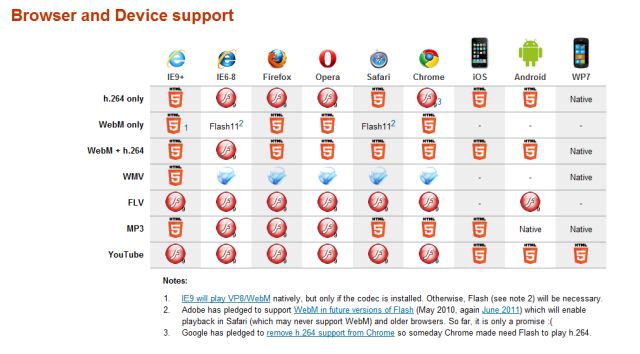
The website MediaElement.js has provided a  comparison of codecing and applicable browsers, including mobile devices.

Browser and device support for HTML5

There is also a large table providing a useful comparison of the HTML5 video player with available features.


Responsive Design – Minutes from the 3rd team meeting

As mentioned in the previous blog this meeting was attended by Dr Mike Wald, Yunjia Li and E.A.Draffan – Gary Wills sent his apologies.

Responsive Design

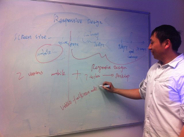
responsive designIt all started on the white board where Yunjia explained how he was adapting his design to fit with the problem of 7 inch plus screens versus the average smart phone screen.  He demonstrated the ever narrowing of the viewing area and how the video, annotation and transcription windows could shrink and eventually offer access via tabs.  But when it came to mobile phone users there was a need to rearrange the view to be totally linear.  In other words two versions of Synote mobile but with changes that would happen automatically depending on the metadata received.

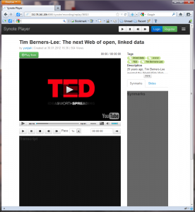
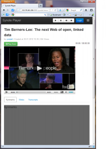
Here are four views of Synote mobile on the different sized screens

1200 and above

Screen size 1200 pixels and above

screen size 980 to 1200

screen size 980 to 1200

screen size 768 to 979

screen size 768 to 979

screen size 480 to 767

screen size 480 to 767

It will be very important to gather the metadata from the media so that the correct view and player can be selected. At present there are 3 useful approaches for this demonstrator – ffmpeg and YouTube has an api with metadata such as title, resolution etc  and finally the link to the file format itself offers metadata which can be drawn out by a commercial service and this would need to be re-created if we did not want to pay for the service.  The minimum amount of data needed is the duration of the media, the format and coding and whether it is video or audio.

It just so happened that there was a blog on this subject that fitted the discussion around screen size issues. Titled “What’s next for mobile now that adaptive design has failed?” it seemed like an appropriate article to read before the meeting.

“Desktop web browsers, tablets, and mobile devices are fundamentally different and are used in very different ways. Across our properties at CBS Interactive, we have experimented with a variety of adaptive and direct designs and are learning the hard way that a one-size-fits-all solution delivers a subpar user experience.” Peter Yared (VentureBeat MobileBeat blog)


 Annotations / Captions

diag of mobile interface

caption illustrationCaptions can be displayed on a desktop with the video but there appear to be no standards for displaying captions within web pages across all  tablets and mobiles alongside transcriptions and annotations.

At present if someone is deaf they have to read the caption and watch the video and then scroll down to the note taking mode.  It is not possible on the iPhone to display both the transcript window and the video due to the size of the screen.  However, it will be possible to capture an image from the video  and annotate this as part of the note taking process.

3rd Team Meeting – Wednesday 23rd May, 2012

wireframe lightbulbThis month seems to have gone by rather quickly and this team meeting will be a small one with Dr Gary Wills away at the moment.  Dr Mike Wald, Yunjia Li and E.A Draffan will meet to hear about Yunjia’s “responsive design for Synote Player and the pages he will be presenting using wireframework’.

He has set the discussion going with the following statement:

“This project will use basic principles of responsive web design to create a new mobile HTML5 version of Synote, able to replay Synote recordings on any student’s mobile device capable of connecting to the Internet.”

Item 2 will be how this is achieved on the various sizes monitors such as those offered on the iPad, Galaxy Tab and iPhone etc.

Item 3 will include the issues that have arisen with the player and being able to read annotations simultaneously whilst watching videos.

As Dr Mike Wald said in a recent email to the team “One issue with captioning overlayed on the video (as suggested for Synote Mobile)  rather than in a separate panel (as we have currently in Synote) is how can a hearing impaired person read the captions when the video is a thumbnail or not displayed at all?  There needs to be a way the captions can be displayed separately … Matterhorn designers are now thinking about ways to do this  …


2nd Team Meeting – Confirm Requirements & Specification for Synote Mobile – 26th April, 2012

Mike and Yunjia thinking about things.

Mike and Yunjia thinking about things.

The team meeting held on 26th April had a simple agenda of confirming the user requirements and specification for Synote Mobile,  based on discussions with colleagues and students in the Web and Internet Science research group and others who have been helping us to debate specific issues and concerns.

Screen size issues

Synote mobile needs to work on mobile phone screens as well as tablet or slate screens – taking the iPhone and iPad as prime examples of the differences it is clear that two versions will need to be developed.

The program should automatically detect the device and load the corresponding page or style sheet. Here are two useful resources:

Yunjia discussed some useful links to help with these requirements:

Best practices for Device detection with Media Queries 

Adding Mobile Views to your Grails Applications with JQuery Mobile: A Real Life Example 

Twitter bootstrap 

Delivery of the videos

The video resources should be delivered in an adaptive way, i.e. devices with low resolution and bandwidth need to download smaller file sizes.

The iPad and iPhone media player does not allow for integrated note taking or annotations so it is proposed that there will be an HTML player version of Synote.

As is mentioned in a blog that discusses the insertion of a video or audio playing link for these devices – the player will take over the fullscreen when playing,so it will not be possible to have a split screen version of the transcriptions or the annotations. Therefore it is proposed that there will be a thumbnail picture displayed alongside the video with the annotations. It is felt that there is a requirement for the extraction of thumbnail pictures when creating annotations.
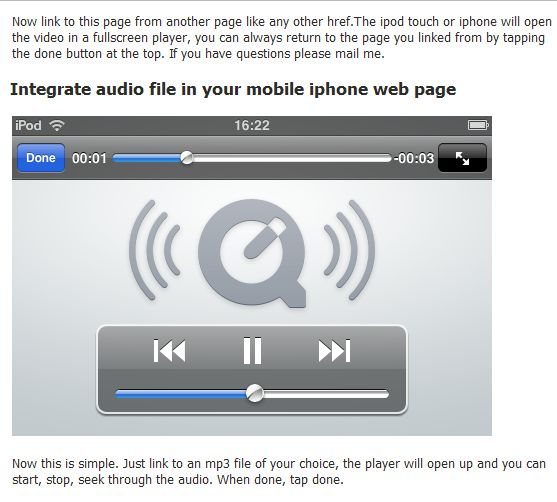
audio player in iphone

Taken from Ploem.be blog as an example of an audio file playing.

HTML5 Players

Considerations around the HTML5 player used have to include the best accessibility options, but with browser differences this is not easy to achieve. HTML video.org offer a helpful comparison of players.

Format Compatibility

Different devices cause format compatibility complications and Safari, Google Chrome and mobile IE also have different support mechanisms for HTML video codec. This means the delivery of multimedia resources has to be adaptable.

Touch interface

There needs to be careful consideration given to the type of gesture driven / tap type controls. Users who wish to have VoiceOver controls will affect the gestures that can be used within not only the player but also the webpages.  It has already been stressed that there is a need to keep clutter to a minimum and therefore there must not be too many buttons in the screen.  It was confirmed that the design would aim to abide by the accessible and ease of use design concepts mentioned in the blog “Research – Planning for an easy to use and accessible mobile app.” 

Despite the issues and concerns raised it is intended that the specifications being developed will have the bonus of offering

  • Web browser access – No app store download needed
  • Automatic enhancements – No need to connect to an app store for updates
  • Speed – adaptive performance on most connections
  • Automatic adjustment of presentation – depending on device screen size
  • Use of existing accounts.

Nutshell – Synote Mobile in 140 characters

Synote mobile logo

Synote Mobile provides users with the ability to access, search, manage and exploit video and audio OER whilst on the move.

Synote Mobile meets the need to make web-based video and audio Open Educational Resources easier to access, search, manage, and exploit.  The recordings can be viewed and repurposed with annotations and tags. Many UK students carry mobile devices capable of replaying video, but lack the interactive apps that encourage learning, Synote Mobile provides a collaborative experience with additional personalisation.

Research – Planning for an easy to use and accessible mobile app.

iPhone accessibility

Link to Apple accessibility web pages

Mobile apps have huge potential to help and liberate people, including disabled people and the elderly, who face challenges with other methods of communication. But as with other new technologies, there is also the potential to further exclude people who are already at a disadvantage by providing small, hard-to-use, inflexible interfaces to devices and apps that create more problems than they solve. (One Voice – Moving Together)

One of the main problems this project will need to overcome when considering ease of use and accessibility is the multitude of portable devices and operating systems. The use of a common code such as HTML 5 may overcome some of the difficulties rather than choosing to program a device dependent native app.

Jakob Nielsen’s Alertbox, September 26, 2011 provides some research into usability with an update on the subject pointing out the need to be aware of ‘fat finger syndrome’ and limit the number of features available. 

When it comes to usability testing, User Centric provide some key pointers that link to co-design and testing prototypes to ensure ease of use. There are answers to the following questions:

  • Does a fully functional prototype have to be built before user testing?
  • Should the user’s device be tested or is it better to provide a device?
  • What devices and user groups should be tested?
  • Are there differences between iPhone and Android users?
  • Do both need to be included in a study?
  • When is lab testing versus remote testing appropriate?

W3C have produced some Mobile Web Best Practices (MWBP) guidelines for developers that are relevant to HTML 5.  There are also the British Standard 8878 guidelines as presented by Jonathan Hassell – BS 8878 in 88 seconds – a lightning summary of the Standard (video with captions and transcript) provides a gallop through of the process!

Perhaps the easiest check list comes from the One Voice for Accessible ICT Coalition

The suggested seven steps are:

  1. Learn about accessibility.
    Learn how a user with a disability may use your app.
  2. Quick accessibility check.
    Get an estimate of how accessible you app is now.
  3. Publish an Accessibility Statement.
    Express your intent to be accessible.
  4. Provide a Contact Us function.
    Enable users to tell you easily about accessibility issues.
  5. Ensure reading sequence is logical and comprehensible.
    Ensure page navigation is simple.
  6. Create a user interface that is easy to understand and operate.
    General usability is an underpinning of accessibility.
  7. Ensure text formatting can be altered.
    Allow users to read text using a size and theme that meets their requirements.
Andoid Accessibility Features

Link to IDEAL Group's Android Accessibility Project


There is no such thing as full accessibility for everyone, but that should not stop app developers from attempting to maximise accessibility. (One Voice: Moving Together)

Welcome – Aims of the Synote Mobile Project

Synote Mobile will meet the important user need to make web-based Open Educational Resources recordings easier to access, search, manage, and exploit for learners, teachers and others.

  • Synote recordings are available as OER
  • Synote is Open Source and freely available
  • Synote facilitates the repurposing of anyone’s OER recordings.

Virtually all UK students carry mobile devices capable of replaying video and want to use them for learning. However the majority of these devices cannot replay Synote’s accessible, searchable, annotated recordings.

This project will create a new mobile HTML5 version of Synote, able to replay Synote recordings on any student’s mobile device capable of connecting to the Internet. Synote Mobile will enable all students to work together on their coursework, projects and revision in more modern flexible environments than desktop computer rooms not designed for collaborative working.

Students using mobile phones

Thanks to Hollycross college (www.holycross.ac.uk)